Inspiration
Leave a comment
Not exactly type, but related and beautiful. This video makes the industrial production look so elegant and also shows the human hands that do the work.
 Some letter and word combinations that are starting to take shape. Purely by coincidence, I really like Milan Kundera’s name set in my new typeface.


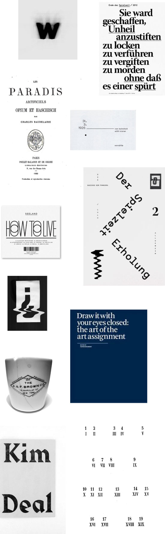
The gallery Articule in Montreal is currently showing a great exhibition from the artist Carl Trahan. For this exhibition, entitled Tous les mots necéssaires (All the Necessary Words), the artist takes on the subject of language used in propaganda during the Third Reich, and the role of typography in promoting the National Socialist agenda. For example, the choice of the typeface Fraktur promoted German nationalism, as this is a typeface that has been in use since the printing of the first Gutenberg bibles. In doing some more research about this typeface, I found some more interesting details about the prevalence of this font up until the mid- 20th c. Taken from the book 500 Years of Printing : " The original reason for the prevalence of the black-letter in Germany and Scandinavian and Slavonic countries in cultural dependance of her may be found in the preponderance of theological over humanistic writings in Germany." Furthermore, the author Steinberg recounts that Fraktur or Blackletter was also reserved exclusively for the German language, and non-German texts or 'foreign words' (Fremdwörter) were always set up in the humanist Antiqua type.

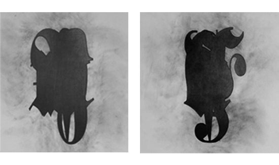
Above is some inspiration for my on-going type design project. Recently, I’ve been more interested in calligraphic lettering and the interesting details that can come from the traditional writing method. I like the precision it takes to make something beautiful with a calligraphy pen. For my project, I’m trying to extract some of those details, and apply them to a digital font.

 The working name for my new font is ‘expedition’. Inspired by the early 20th c. race to the South Pole, I used calligraphic lettering as a starting point. Hand-done lettering takes precision, care and exactness. I want this font to conjure activities which require extreme discipline, and which can succumb to human error or fault. Athletes, explorers/adventurers, pioneers, etc. all share an unwavering desire to achieve excellence, to reach a goal and push the boundaries of one’s physical and metal capacities. After looking at some of Amundsen’s expedition photographs, I tried to incorporate some of the atmosphere from a frigid and arduous trek.
Some things I’ve been looking at for inspiration:
(above images from top to bottom)
Kurier typeface
Lydian typeface
stone engraved letters
an extract from Graphic magazine
the COS logotype
___________________________________________________________________________________________________________________________
Some of my preliminary work in progress.


Jost Hochuli’s Detail in Typography (translated from Das Detail in der typografie) covers, as the name suggests, the nuances that affect our reception of written information– aesthetics of a practical nature– based on our physiological ability to interpret letters, words and blocks of text. The author goes from ultra-micro to micro in detail, highlighting several areas in the physical make-up of type. Although originally written in 1984, Detail in Typography already points out that ‘macrotypography’ (layout and information architecture) has started to take a front seat to typesetting, which he attributes to new technological developments. Computer-aided design has certainly saved this generation of designers from many pain-staking tasks, but it is clear that detail has fallen by the wayside. Maybe the most interesting and salient point Hochuli makes is that ideal aesthetics in typography do not relate to mechanical perfection, but it is the human ‘imperfections’ that makes all the difference the legibility of a body of text and in our appreciation of letterforms.
See also: Roland Früh’s review of Details in Typography in issue #25 of étapes (international edition)
in print.
More books from designer/writer Jost Hochuli: Bücher machen (1989) ; Buchgestaltung in der Schweiz (1993) ; in collaboration with Robin Kinross, Designing books: practice and theory (Hyphen Press, 1996) and a monograph Jost Hochuli: Drucksachen, vor allem Bücher (Niggli Verlag, 2002). He has also designed and published Typotron, series of booklets (1983-1998).


Currently, I’m working on designing an angular font, initially influenced by Wim Crowel’s grid-based ‘Gridnik’. This font first caught my eye in the context of the Swedish Moderna Museet’s graphic identity. The hard-edges and geometric shapes contrasted with their ‘signature’ logotype is an intriguing combination. The last two letterforms have interesting details on their corners, as if folded. I want to take some of these elements and create a font that is still versatile, and not overly eccentric.
Images from top to bottom:
Wim Crowel’s Gridnik
Sulki & Min’s Politie, an adaptation of Gridnik
Playtype’s 4590
Character found on Studio Feed’s website
Mutek festival logotype

It’s the start of a new year and tons of new type discoveries are waiting to be made. I will keep the first post of 2012 short and sweet. To start off the new year, I will be writing about the calligraphic font trend, Wim Crouwel’s Gridnik, and unearthing experimental newspapers and publications. Stay tuned!
