Not exactly type, but related and beautiful. This video makes the industrial production look so elegant and also shows the human hands that do the work.
Books
Detail in Typography
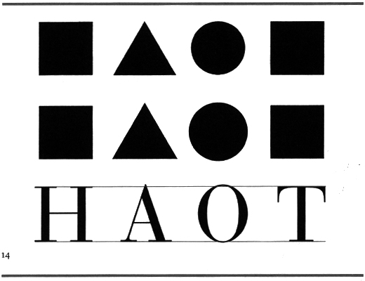
Jost Hochuli’s Detail in Typography (translated from Das Detail in der typografie) covers, as the name suggests, the nuances that affect our reception of written information– aesthetics of a practical nature– based on our physiological ability to interpret letters, words and blocks of text. The author goes from ultra-micro to micro in detail, highlighting several areas in the physical make-up of type. Although originally written in 1984, Detail in Typography already points out that ‘macrotypography’ (layout and information architecture) has started to take a front seat to typesetting, which he attributes to new technological developments. Computer-aided design has certainly saved this generation of designers from many pain-staking tasks, but it is clear that detail has fallen by the wayside. Maybe the most interesting and salient point Hochuli makes is that ideal aesthetics in typography do not relate to mechanical perfection, but it is the human ‘imperfections’ that makes all the difference the legibility of a body of text and in our appreciation of letterforms.
See also: Roland Früh’s review of Details in Typography in issue #25 of étapes (international edition)
in print.
More books from designer/writer Jost Hochuli: Bücher machen (1989) ; Buchgestaltung in der Schweiz (1993) ; in collaboration with Robin Kinross, Designing books: practice and theory (Hyphen Press, 1996) and a monograph Jost Hochuli: Drucksachen, vor allem Bücher (Niggli Verlag, 2002). He has also designed and published Typotron, series of booklets (1983-1998).
